The option of using pure HTML (sometimes with a dab of CSS) for form
validation was until recently unthinkable. Sure there have been all
kinds of whacky JavaScript plug-ins over the years aimed at achieving
something similar, but never a single standard that we could work
towards.
For a more detailed introduction to HTML5 form validation you can find some great articles linked under References below. In this article we intend to present only a number of simple examples to get you started.
Before you ask, and someone always does, these examples will currently work only in the following browsers: Safari 5, Chrome 6, Opera 9, Firefox 4 Beta and the iPhone/iPad. Also each browser has a slightly different default behaviour.
We have actually created our own valid/invalid formatting using CSS to override the browser default, but more on that later. That's why you may see something like the following in the example above:
 Before you type anything into the box a red marker is shown. As
soon as a single character has been entered this changes to a green
marker to indicate that the input is 'valid'.
Before you type anything into the box a red marker is shown. As
soon as a single character has been entered this changes to a green
marker to indicate that the input is 'valid'.
Using CSS you can place markers inside or alongside the input box, or simply use background colours and borders as some browsers do by default.
On the iPhone/iPad the different input types are associated with different keyboards, making it easier for people to complete your online forms. In other web browsers they can be used in combination with the required attribute to limit or give advice on allowable input values.
The above code displays an input box as follows:
Again, different browsers implement this differently. In Opera it's sufficient to enter just *@* for the input to be accepted. In Safari, Chrome and Firefox you need to enter at least *@-.-. Obviously neither example is very limiting, but it will prevent people from entering completely wrong values, or even spaces.
Here is how it appears in Safari:
This time the minimum requirement for most browsers is one or more letters followed by a colon. Again, not very helpful, but it will stop people trying to input their email address or other such nonsense.
As mentioned above, we can improve on this by making use of the pattern attribute which accepts a JavaScript regular expression. So the code above becomes:
If you're not yet familiar with regular expressions, you really should make it a priority to learn. For those already familiar, note that the ^ and $ are already implicit so the input has to match the entire expression. Pattern modifiers are not supported.
If anyone wants to contribute a more 'thorough' expression to test for valid email or url format, feel free to post it usin the Feedback form.
Here you see an example including both a number input, typically displayed as a 'roller' and a range input displayed as a 'slider':
The slider option is a bit bizarre in that no values are displayed, but may be useful for more 'analog' inputs. There are some bugs with the number input in that if you don't set a max value, clicking 'down' with the input blank will result in a very large number.
Here is how the two inputs are displayed in Safari:
 and in Opera:
 They are currently not supported in Firefox 4 Beta.
If you want to restrict the input of a text field to numbers without having the up/down arrows associated with the input box, you can always just set the input type to text and use a pattern of "\d+" (one or more numbers).
The tel input type is handy for the iPhone as it selects a different input keyboard. There is no pattern-matching set by default so you would have to implement that yourself using the pattern attribute to accept only certain characters.
The color input is meant to let you select a hex-code from a colour wheel - or similar - but as yet doesn't appear to have been implemented in the wild.
The other date- and time-related options do have an effect at least in Opera, with pop-up calendars and other devices appearing to assist with input. While it would be great to see something like this in every browser, for now you probably need to stick with the ubiquitous JavaScript plugins.
The -moz-box-shadow style is there just to prevent Firefox 4 Beta from adding it's default red border.
For inputs that are both required and 'valid' you can use the following:
This solution is still more complicated than it needs to be as it requires two extra images to be loaded. Fortunately, we can assume that all browsers supporting HTML5 form validation techniques will also support images being replaced in the CSS by 'Base64 encoded datasets'.
Using a service such as Spritebaker or other techniques, the above style settings become:
For the browser-impaired, this is how the input field appears in Safari with either the image or the 'sprite' backgrounds (there is no difference between the two options):
 The same styling can be extended to textarea elements, but
won't work for checkboxes, select elements, etc. For the latter you
might want to place the valid/invalid markers alongside the element or
format those input elements using borders, background colours, etc.
The same styling can be extended to textarea elements, but
won't work for checkboxes, select elements, etc. For the latter you
might want to place the valid/invalid markers alongside the element or
format those input elements using borders, background colours, etc.
For a more detailed introduction to HTML5 form validation you can find some great articles linked under References below. In this article we intend to present only a number of simple examples to get you started.
Before you ask, and someone always does, these examples will currently work only in the following browsers: Safari 5, Chrome 6, Opera 9, Firefox 4 Beta and the iPhone/iPad. Also each browser has a slightly different default behaviour.
1. The 'required' attribute
The simplest change you can make to your forms is to mark a text input field as 'required':Your Name: <input type="text" name="name" required>
This informs the (HTML5-aware) web browser that the field is to be
considered mandatory. Different browsers may mark the input box in
some way (Firefox 4 Beta adds a red box-shadow by default), display a
warning (Opera) or even prevent the form from being submitted if this
field has no value. Hopefully these behaviours will converge in
future releases.We have actually created our own valid/invalid formatting using CSS to override the browser default, but more on that later. That's why you may see something like the following in the example above:
Using CSS you can place markers inside or alongside the input box, or simply use background colours and borders as some browsers do by default.
2. Different INPUT types
This is where HTML5 really gets interesting and more useful. Along with the text input type, there are now a host of other options, including email, url, number, tel, date and many others.On the iPhone/iPad the different input types are associated with different keyboards, making it easier for people to complete your online forms. In other web browsers they can be used in combination with the required attribute to limit or give advice on allowable input values.
INPUT type="email"
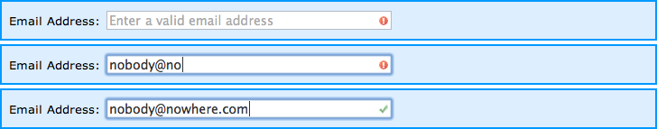
By changing the input type to email while also using the required attribute, the browser can be used to validate (in a limited fashion) email addresses:Email Address: <input type="email" name="email" required placeholder="Enter a valid email address">
Note that for this example we've made use of another HTML5
attribute placeholder which lets us display a prompt or
instructions inside the field - something that previously had to be
implemented using messy onfocus and onblur
events.The above code displays an input box as follows:
Again, different browsers implement this differently. In Opera it's sufficient to enter just *@* for the input to be accepted. In Safari, Chrome and Firefox you need to enter at least *@-.-. Obviously neither example is very limiting, but it will prevent people from entering completely wrong values, or even spaces.
Here is how it appears in Safari:
INPUT type="url"
In a similar fashion to the email input type above, this one is designed to accept only properly-formatted URLs. Of course it currently does nothing of the kind, but later you will see how to improve it's behaviour using the pattern attribute.Website: <input type="url" name="website" required>
Again, the input box appears as normal:This time the minimum requirement for most browsers is one or more letters followed by a colon. Again, not very helpful, but it will stop people trying to input their email address or other such nonsense.
As mentioned above, we can improve on this by making use of the pattern attribute which accepts a JavaScript regular expression. So the code above becomes:
Website: <input type="url" name="website" required pattern="https?://.+">
Now our input box will only accept text starting with http:// or https:// and at least one additional character:If you're not yet familiar with regular expressions, you really should make it a priority to learn. For those already familiar, note that the ^ and $ are already implicit so the input has to match the entire expression. Pattern modifiers are not supported.
If anyone wants to contribute a more 'thorough' expression to test for valid email or url format, feel free to post it usin the Feedback form.
INPUT type="number" and type="range"
The number and range input types also accept parameters for min, max and step. In most cases you can leave out step as it defaults to 1.Here you see an example including both a number input, typically displayed as a 'roller' and a range input displayed as a 'slider':
Age: <input type="number" size="6" name="age" min="18" max="99" value="21"><br>
Satisfaction: <input type="range" size="2" name="satisfaction" min="1" max="5" value="3">
As with other HTML5 input types, browsers that don't recognise the
new options will default to simple text inputs. For that reason it's a
good idea to include a size for the input box.The slider option is a bit bizarre in that no values are displayed, but may be useful for more 'analog' inputs. There are some bugs with the number input in that if you don't set a max value, clicking 'down' with the input blank will result in a very large number.
Here is how the two inputs are displayed in Safari:
If you want to restrict the input of a text field to numbers without having the up/down arrows associated with the input box, you can always just set the input type to text and use a pattern of "\d+" (one or more numbers).
3. Other HTML5 INPUT types
Other valid HTML5 input types include:- color
- date
- datetime
- datetime-local
- month
- search
- tel
- time
- week
The tel input type is handy for the iPhone as it selects a different input keyboard. There is no pattern-matching set by default so you would have to implement that yourself using the pattern attribute to accept only certain characters.
The color input is meant to let you select a hex-code from a colour wheel - or similar - but as yet doesn't appear to have been implemented in the wild.
The other date- and time-related options do have an effect at least in Opera, with pop-up calendars and other devices appearing to assist with input. While it would be great to see something like this in every browser, for now you probably need to stick with the ubiquitous JavaScript plugins.
4. Styling valid/invalid inputs using CSS
While the code we're using is slightly more complicated, this should get you started:input:required:invalid, input:focus:invalid {
/* insert your own styles for invalid form input */
-moz-box-shadow: none;
}
The first set of styles can be used to mark an input box as
'invalid', by adding an icon, colouring the text or borders or similar.
It will apply to inputs that are required but empty, or to
inputs that have a required format/pattern which hasn't yet been met.The -moz-box-shadow style is there just to prevent Firefox 4 Beta from adding it's default red border.
For inputs that are both required and 'valid' you can use the following:
input:required:valid {
  /* insert your own styles for valid form input */
}
Some of the articles below, particularly the first two, provide
other style/scripting options and solutions for supporting older
browsers.5. Sample styling using images and sprites
As shown above, once you've added HTML5 attributes to your form elements, they can be easily styled using CSS so that each input field is clearly marked as valid or invalid.input:required:invalid, input:focus:invalid {
background-image: url(/images/invalid.png);
background-position: right top;
background-repeat: no-repeat;
}
input:required:valid {
background-image: url(/images/valid.png);
background-position: right top;
background-repeat: no-repeat;
}
Here you can see the above styles applied to a required input field:This solution is still more complicated than it needs to be as it requires two extra images to be loaded. Fortunately, we can assume that all browsers supporting HTML5 form validation techniques will also support images being replaced in the CSS by 'Base64 encoded datasets'.
Using a service such as Spritebaker or other techniques, the above style settings become:
<style type="text/css">

  input:required:invalid, input:focus:invalid {
    background-image:
url('data:image/png;base64,iVBORw0KGgoAAAANSUhEUgAAABAAAAAQCAYAAAAf8/9hAAAAGXRFWHRTb2Z0d2FyZQBBZG9iZSBJbWFnZVJlYWR5ccllPAAAAeVJREFUeNqkU01oE1EQ/mazSTdRmqSxLVSJVKU9RYoHD8WfHr16kh5EFA8eSy6hXrwUPBSKZ6E9V1CU4tGf0DZWDEQrGkhprRDbCvlpavan3ezu+LLSUnADLZnHwHvzmJlvvpkhZkY7IqFNaTuAfPhhP/8Uo87SGSaDsP27hgYM/lUpy6lHdqsAtM+BPfvqKp3ufYKwcgmWCug6oKmrrG3PoaqngWjdd/922hOBs5C/jJA6x7AiUt8VYVUAVQXXShfIqCYRMZO8/N1N+B8H1sOUwivpSUSVCJ2MAjtVwBAIdv+AQkHQqbOgc+fBvorjyQENDcch16/BtkQdAlC4E6jrYHGgGU18Io3gmhzJuwub6/fQJYNi/YBpCifhbDaAPXFvCBVxXbvfbNGFeN8DkjogWAd8DljV3KRutcEAeHMN/HXZ4p9bhncJHCyhNx52R0Kv/XNuQvYBnM+CP7xddXL5KaJw0TMAF8qjnMvegeK/SLHubhpKDKIrJDlvXoMX3y9xcSMZyBQ+tpyk5hzsa2Ns7LGdfWdbL6fZvHn92d7dgROH/730YBLtiZmEdGPkFnhX4kxmjVe2xgPfCtrRd6GHRtEh9zsL8xVe+pwSzj+OtwvletZZ/wLeKD71L+ZeHHWZ/gowABkp7AwwnEjFAAAAAElFTkSuQmCC');

    background-position: right top;
    background-repeat: no-repeat;
    -moz-box-shadow: none;
  }
  input:required:valid {
    background-image:
url('data:image/png;base64,iVBORw0KGgoAAAANSUhEUgAAABAAAAAQCAYAAAAf8/9hAAAAGXRFWHRTb2Z0d2FyZQBBZG9iZSBJbWFnZVJlYWR5ccllPAAAAepJREFUeNrEk79PFEEUx9/uDDd7v/AAQQnEQokmJCRGwc7/QeM/YGVxsZJQYI/EhCChICYmUJigNBSGzobQaI5SaYRw6imne0d2D/bYmZ3dGd+YQKEHYiyc5GUyb3Y+77vfeWNpreFfhvXfAWAAJtbKi7dff1rWK9vPHx3mThP2Iaipk5EzTg8Qmru38H7izmkFHAF4WH1R52654PR0Oamzj2dKxYt/Bbg1OPZuY3d9aU82VGem/5LtnJscLxWzfzRxaWNqWJP0XUadIbSzu5DuvUJpzq7sfYBKsP1GJeLB+PWpt8cCXm4+2+zLXx4guKiLXWA2Nc5ChOuacMEPv20FkT+dIawyenVi5VcAbcigWzXLeNiDRCdwId0LFm5IUMBIBgrp8wOEsFlfeCGm23/zoBZWn9a4C314A1nCoM1OAVccuGyCkPs/P+pIdVIOkG9pIh6YlyqCrwhRKD3GygK9PUBImIQQxRi4b2O+JcCLg8+e8NZiLVEygwCrWpYF0jQJziYU/ho2TUuCPTn8hHcQNuZy1/94sAMOzQHDeqaij7Cd8Dt8CatGhX3iWxgtFW/m29pnUjR7TSQcRCIAVW1FSr6KAVYdi+5Pj8yunviYHq7f72po3Y9dbi7CxzDO1+duzCXH9cEPAQYAhJELY/AqBtwAAAAASUVORK5CYII=');

    background-position: right top;
    background-repeat: no-repeat;
  }

</style>
The above code can now be copied directly to your CSS style sheet.
There's no need to copy any images and, especially if your style-sheets
are gzip-compressed, there will be next to no impact on load times. In
a few minutes you could have your whole website updated.For the browser-impaired, this is how the input field appears in Safari with either the image or the 'sprite' backgrounds (there is no difference between the two options):
6. Fallback for the placeholder attribute
The following JavaScript, placed or included at the end of the page, should enable support for the placeholder attribute in INPUT fields at least for Internet Explorer 8+, Firefox and Opera:<script type="text/javascript">
// ref: http://diveintohtml5.org/detect.html
function supports_input_placeholder()
{
var i = document.createElement('input');
return 'placeholder' in i;
}
if(!supports_input_placeholder()) {
var fields = document.getElementsByTagName('INPUT');
for(var i=0; i < fields.length; i++) {
if(fields[i].hasAttribute('placeholder')) {
fields[i].defaultValue = fields[i].getAttribute('placeholder');
fields[i].onfocus = function() { if(this.value == this.defaultValue) this.value = ''; }
fields[i].onblur = function() { if(this.value == '') this.value = this.defaultValue; }
}
}
}
</script>
7. INPUT patterns for different data types
URL input pattern:
input type="url" pattern="https?://.+"
IPv4 Address input pattern:
input type="text" pattern="\d{1,3}\.\d{1,3}\.\d{1,3}\.\d{1,3}"
Date input pattern (dd/mm/yyyy or mm/dd/yyyy):
input type="text" pattern="\d{1,2}/\d{1,2}/\d{4}"
Price input pattern:
input type="text" pattern="\d+(\.\d{2})?"
Latitude/Longitude input pattern:
input type="text" pattern="-?\d{1,3}\.\d+"
Feel free to send any patterns you find useful using the Feedback form.
No comments:
Post a Comment